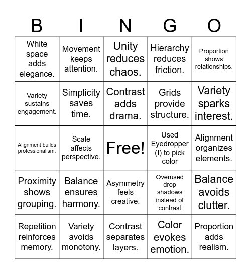

This bingo card has a free space and 100 words: Used Ctrl+J / Cmd+J to duplicate a layer, Contrast draws attention., Alignment organizes elements., Repetition builds consistency., Proximity shows relationships., White space improves clarity., Hierarchy guides the eye., Scale shows importance., Color creates mood., Typography sets tone., Simplicity strengthens impact., Rhythm adds flow., Unity brings harmony., Variety avoids monotony., Legibility is essential., Accessibility includes everyone., Grids provide structure., Symmetry feels formal., Asymmetry feels dynamic., Emphasis highlights key points., Contrast improves readability., Used fireworks for the Fourth of July, Created a Father’s Day poster with ties, Repetition builds rhythm., Consistency creates trust., Used Eyedropper (I) to pick color, Proportion shows relationships., Overused drop shadows instead of contrast, Movement guides attention., Harmony blends elements., Scale affects perspective., White space adds elegance., Typography must be readable., Fonts should match mood., Color evokes emotion., Contrast adds drama., Balance avoids clutter., Hierarchy improves flow., Repetition makes patterns., Simplicity reduces noise., Used Tab to hide panels, Asymmetry creates tension., Alignment builds professionalism., Rhythm adds life., Variety sparks interest., Unity reduces chaos., Proximity avoids confusion., Negative space speaks too., Composition matters most., Contrast separates layers., Balance can be informal., Typography defines personality., Proportion keeps harmony., Repetition creates identity., Movement creates storytelling., Simplicity supports usability., Color guides hierarchy., Balance affects emotions., Clarity beats complexity., Hierarchy reduces friction., Emphasis clarifies purpose., Accessibility ensures reach., Alignment makes design neat., Rhythm creates consistency., White space improves focus., Legibility ensures comprehension., Typography enhances aesthetics., Proximity organizes information., Consistency aids recognition., Contrast builds excitement., Scale signals priority., Balance ensures harmony., Unity ties everything together., Simplicity improves communication., Repetition enhances branding., Alignment avoids disorder., Rhythm creates flow., Variety sustains engagement., Hierarchy directs scanning., Color balance prevents strain., Emphasis guides interaction., Proportion adds realism., Symmetry feels calm., Asymmetry feels creative., Gestalt simplifies complexity., Movement keeps attention., White space reduces clutter., Fonts must be purposeful., Consistency builds credibility., Proximity shows grouping., Balance prevents distraction., Harmony reduces stress., Contrast increases visibility., Repetition reinforces memory., Simplicity saves time., Alignment supports grids., Typography reflects brand., Clarity enables usability., Scale influences focus. and Good design solves problems..
Graphic Design Principles and Terms | Graphic Design Basics | Graphic Design Basics | Principles of Design | Principles and Elements of Art Bingo
Share this URL with your players:
For more control of your online game, create a clone of this card first.
Learn how to conduct a bingo game.
With players vying for a you'll have to call about __ items before someone wins. There's a __% chance that a lucky player would win after calling __ items.
Tip: If you want your game to last longer (on average), add more unique words/images to it.