(Print) Use this randomly generated list as your call list when playing the game. There is no need to say the BINGO column name. Place some kind of mark (like an X, a checkmark, a dot, tally mark, etc) on each cell as you announce it, to keep track. You can also cut out each item, place them in a bag and pull words from the bag.
1
2
3
4
5
6
7
8
9
10
11
12
13
14
15
16
17
18
19
20
21
22
23
24
25
26
27
28
29
30
31
32
33
34
35
36
37
38
39
40
41
42
43
44
45
46
47
48
49
50
51
52
53
54
55
56
57
58
59
An element of art made up of three properties: hue, value, and intensity.
opposite of opaque, transparent watercolor allows light to penetrate the pigment allowing the white of the paper to show
through the pigment
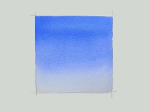
gradient
the lightness or darkness of tones or colors.
texture
- refers to free form shapes and free flowing lines. Opposite of geometrical.
- a tiny pool of color formed by gravity at the bottom of a wet wash when applied to tilted or slanted watercolor paper.
line
pure color plus white pigment or with water added to dilute the color in transparent watercolor.
- are those colors directly opposite or across from each other on the color wheel, such as red and green or yellow and violet
shape
opposite of transparent, opaque watercolor reflects light rather than letting light pass through it.
color
is the difference between elements of art in a composition, such that each element is made stronger in relation to the other. When placed next to each other, contrasting elements command the viewer's attention. Areas of contrast are among the fir
- the area around and behind the main subject in a painting.
a transparent wash of color over another color modifying the underlying color.
is the uniform repetition of any of the elements of art or any combination thereof.
Ranging from light-to-dark, starting with white, the lighter grays, the darker grays, then black.
flat-wash
what the eye sees when light bounces off an object, such as red, blue, or yellow, etc.
emphasis
a basic components/parts used by artists in designing a painting: color, value, shape, space, line,
form, and texture.
tint
- the application of wet paint onto wet paper.
space
the space in a painting that is not occupied by the subject matter that is still part of the overall designed of the
painting.
value
two or more media used together in a painting.
An element of art that refers to the way things feel, or look as if they might feel if touched
sharp shapes or lines that did not blend into adjacent areas.
glazing
- any gradual change in hue, value, or color intensity.
You want your painting to feel unified such that all the elements fit together comfortably. Too much unity creates monotony, too much variety creates chaos.You need both.
pure color plus black pigment creating a neutralized version of a color.
hue
An element of art that is three-dimensional and encloses volume; includes height, width AND depth (as in a cube, a sphere, a pyramid, or a cylinder). Form may also be free flowing.
is the result of using the elements of art such that they move the viewer's eye around and within the image.
is created by movement implied through the repetition of elements of art in a non-uniform but organized way.
An element of art that is two-dimensional, flat, or limited to height and width.
allowing the value or color of an edge to blend or blur into nearby areas without definite lines of separation.
a wash that gradually changes in value
the ratio of one art element to another. It is important to keep in mind the relationship between different elements of the composition so that the scale of your artwork always makes visual sense.
are predominantly hues ranging from yellow to orange to red.
the counterweight to harmony and creates visual interest by slightly changing or using different elements together in a composition. It can be created with contrast, change, elaboration, or diversifying elements.
shade
the name of a pure color such as "red" "blue" or "green" etc.
- a design principle that refers visually to the equalization of the elements in a painting. The three types are: symmetrical (formal), asymmetrical
(informal), or radial (circular, radiating for a central point).
is an area of evenly distributed color. "Flat" meaning the color remains the same hue, value(or intensity) and textural quality. No brush
strokes showing.
bead
to take out or remove paint from an area of a watercolor painting.
Hues next to each other on the color wheel
When one element of an artwork stands out more than another.
form
a thin fluid application of watercolor on either wet or dry watercolor paper. A wash usually implies laying down color on a broad area of paper.