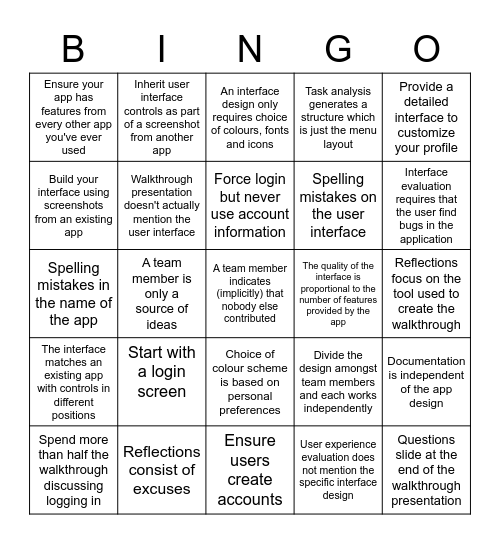

This bingo card has 25 words: Start with a login screen, Ensure users create accounts, Force login but never use account information, Spend more than half the walkthrough discussing logging in, Provide a detailed interface to customize your profile, Ensure your app has features from every other app you've ever used, Build your interface using screenshots from an existing app, Inherit user interface controls as part of a screenshot from another app, The quality of the interface is proportional to the number of features provided by the app, Choice of colour scheme is based on personal preferences, Spelling mistakes on the user interface, Spelling mistakes in the name of the app, Divide the design amongst team members and each works independently, Documentation is independent of the app design, Walkthrough presentation doesn't actually mention the user interface, Questions slide at the end of the walkthrough presentation, Reflections focus on the tool used to create the walkthrough, An interface design only requires choice of colours, fonts and icons, Interface evaluation requires that the user find bugs in the application, A team member is only a source of ideas, A team member indicates (implicitly) that nobody else contributed, Reflections consist of excuses, The interface matches an existing app with controls in different positions, Task analysis generates a structure which is just the menu layout and User experience evaluation does not mention the specific interface design.
Apple Event BINGO | Pharmacy Software Fails | Powerpoint, Database, | What have you done with Copilot so far?? | WWDC 2024 BINGO CARD
Share this URL with your players:
For more control of your online game, create a clone of this card first.
Learn how to conduct a bingo game.
With players vying for a you'll have to call about __ items before someone wins. There's a __% chance that a lucky player would win after calling __ items.
Tip: If you want your game to last longer (on average), add more unique words/images to it.